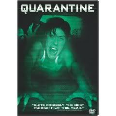
This is something I should've addressed months back, but for whatever (lazy) reasons I've taken my sweet-lolly-gagging time. One of the DVDs hits stores today, though, and then the other was brought to my attention earlier by a co-worker, so my anger toward the following two DVD covers has been re-ignited to maximum boiling. For every awesome DVD cover, such as Frank Darabont's The Mist's two-disc special edition, or either Grindhouse film, there comes triple the amount of poorly-conceived, misleading, film-raping designs such as these, and it's truly inexcusable.
Culprit Number One: Quarantine (which hits stores today, and I suggest you rent it)

The same unbelievable problem that I had with the film's in-theater posters and commercial advertisements is at hand here, since this is exactly the same shot---why in the hell would the dumbasses over at Screen Gems show the film's [SLIGHT SPOILER ALERT] final shot on the fucking poster?! And if you recall the film's all-too-revealing trailer, this image was the last one seen in that, too! I'm at a loss for words, really. Sure, you can say that people haven't seen the film yet, so they won't know that this is the last shot, but then you'd be a total airhead. What this does, in argument against such a stance, is begs viewers to groan and moan as the final credits roll---"Are you kidding me? That's the ending? They showed that in the damn commercials!" I saw Quarantine three times in the theater (because I'm a tool like that), and I heard at least ten people uttering that very sentiment as they exited the theater.
Oh, and how about that Photoshop hack-job on the left side of Jennifer Carpenter, the generic ghoul/creature that never even shows up in the film? Are you kidding me? Is he trying to look scary/intimidating, or just waving at prospective buyers? As if to say, "Hey, look, I'm a creepy-looking ghoul and I'm in this movie, too! You know you want to buy this shit now, right? How can you resist a ghoul that looks like every other ghoul you've seen in horror movies, even if I'm not in this one?" The Screen Gems folks behind this cover should collectively blow me where the pampus is.
It basically undermines the entire film, and the work put in by the talented cast and the filmmaking Dowdle Brothers. I'd be willing to bet a couple stacks that the Dowdles had no say in this matter, and being first-time major studio filmmakers they just grinned and endured. The movie still received largely positive reviews, thankfully, and even made a nice box office profit, but those positives don't make up for the absolutely-abysmal marketing team behind the film.
Don't even get me started on how this poster completely slaps all those who had seen and loved Quarantine's Spanish original, [REC], and already knew how the almost-shot-for-shot American version would end. Remember, fools at Screen Gems: in a case like this, when you're redoing a beloved foreign property, the mission is to soothe the original's rabid fanbase, not anger them even further.
Culprit Number Two: The Last House on the Left's latest special edition (timed with the remake's release next month)

Just when I'd thought that no DVD cover could infuriate me more than Quarantine's....this debacle of immense proportions surfaces, and baffles my mind to degrees that require at least five Tylenol tablets.
What we have here is nothing more than a blatant attempt to make a sleazy, depraved, low-fi '70s classic appeal to today's spoon-fed, mostly-brain-dead generation of moviegoers that actually made the Prom Night remake a resounding success. This artwork basically makes Last House on the Left look like a straight-to-DVD Prom Night sequel, and just imagine how bad such a film would be. If not for that little mention of Wes Craven's name at the top lefthand corner, I'd have no reason to believe that this wasn't some half-assed DVD-only remake meant to compete with the good-looking, Craven-supported one hitting theaters in early March. First of all, that looks nothing like the house seen in Craven's actual film. Secondly, the girl's face is clearly that of a modern-day actress, and doesn't even try to appear as if from a 1970s-era movie still.
Now, you may think it's pointless and a bit corny of me to get so worked up over something as infinitesimal as a lame Last House on the Left DVD cover, but then you must not know me very well, if at all. This is precisely the kind of useless shit that does grind my gears, because I'm a fella who takes his movies very seriously. To a fault, I'm sure. Besides, I defy you to watch this Last House on the Left trailer, then look at the above DVD cover, and think to yourself, "My, that is one effective, genuine-looking DVD cover":
You want to know what the ironic, and somewhat sad, part of this is: I've already bought that Quarantine disc, and plan on grabbing that Last House on the Left one soon. So much for me taking a stand, huh? The movies found beneath the gross packaging remain the same quality viewing experiences as I loved once before, so it's pretty much a mute tirade. But one that, if I'd just kept my mouth shut instead of airing my thoughts out, I'd feel a bit less proud.


No comments:
Post a Comment